BizLibrary
EdTech
St. Louis, Mo
BizLibrary Brand Design
You can find the BizLibrary Design Language official documentation website here.
Crafting the brand
As the Staff Brand Designer, I was responsible for the creation and curation of all brand assets, our marketing website, and our small component system.
Identifying challenges
When I first arrived on the team, I asked a lot of (dumb) questions. I wanted to know about our process, guidelines, who I would partner with, and most of all, our user. I jumped right in to google analytics to find out about the people visiting our website.
I parsed through the demographics relevant to our brand:
24–36
Movies Travel Technology Shopping Real estate Beauty
1920×1080
Female
HR, L&D
The most interesting part that stood out to me was that our main demographic for our marketing site visitors were women.
Prior to this very limited research, all of our marketing efforts were pointed at the men in the CFO or CEO positions who wrote the checks to our sales team.
Our brand was very masculine with dark images that felt like a sweaty fitness ad.
Through deeper research sparked by my jaunt in to Google Analytics, we’ve since found our target market are the HR Generalists that know their business needs a learning & development program and they need big-time help pushing their initiatives through their leadership group. We’ve pivoted our marketing, content, and sales outreach to fully supporting these people in their endeavors.
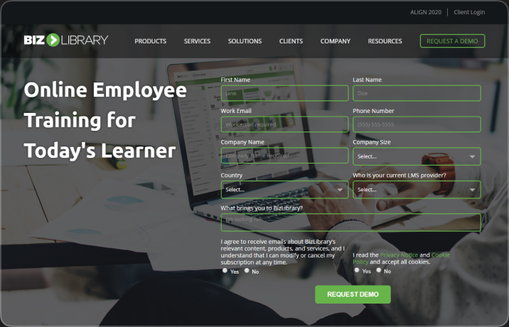
Low website conversion rate
Our website’s request-a-demo form had the lowest conversion rate we’d seen at BizLibrary. There were accessibility issues with that form, and forms in general on the website. If our forms aren’t easy to use, of course conversions would drop. This inspired me to audit a bit more of our website for accessibility issues.
Accessibility Concerns
I ended up finding out in my accessibility audit that our primary green wasn’t up to WCAG compliance to readers when white text was placed on top.
Punch
Navy
Green
Gold
Blue
Punch
Navy
Green
Gold
Blue
Creating trust
I certainly didn’t want to be the cliché designer that jumps on a team and blows everyone up by trying to change everything at once. I took my time, created nice looking work that fell within the standards, and made sure to defend any ‘forward-thinking’ design decisions with accessibility facts and solid reasoning for any design changes that occurred.
I leveled up.
I wasn’t thinking like a mid-level designer anymore. I was able to create strong opinions and defend them with quantitative data & qualitative research, which marketers seem to understand very well. After doing this for a few months, and a conversion rate that had increased by 42%, I finally got the trust from leadership and I put together a proposal to refresh our brand.
Visual style guidelines
Typography
Typography is the essence of graphic design. Without typography, there is only illustration. Our livelihood in this profession rests solely on our exceptional ability to visually communicate with the written word.
Our typefaces were the immoveable object in this endeavor. Forever to be Ubuntu and Open Sans.
I created a typographic system for use on various mediums such as web, mobile, and Microsoft Office Apps that featured Ubuntu on headlines, and Open Sans for body and productive copy.

Color
Color is a powerful tool for communicating and creating brand identity. In a business setting, it can evoke emotions, grab attention, and create a memorable impression on customers. By using a consistent color palette, BizLibrary can build a strong visual identity and establish a recognizable brand that stands out from the competition.
By strategically using our color palette, we can reinforce our brand values, promote our product and features, and ultimately make a lasting impact on our audience.

Shape
Shapes are a crucial element of visual design and play a vital role in creating a strong and recognizable brand identity. Shapes can evoke emotions, add depth, and help to differentiate our brand from its competitors.
Why are shapes important?
- Shapes add visual interest and help to break up text and images on a page.
- They can be used to create a sense of hierarchy and draw attention to specific elements.
- Shapes can be used to reinforce brand messaging and values.
- Consistent use of shape across all marketing materials helps to establish a strong and recognizable brand identity.
Logomark
With the new brand standards in place, the old mark didn’t feel cohesive with the direction we’re headed. The mark is supposed to be a “Play” button, but the shape and the name BizLibrary, it just felt like a bookend.
We’ve always been conscious of the “Library” in our name. Never associating ourselves with books or an actual library, but our content steals the show in all of our product offerings. People come to us to solve their compliance needs with our in-house produced content - being associated with a lot of content is important, but felt like we should take the book-end look and rearrange it to be of a more contemporary “Play” button with softer corners.
I modified Inter for the word mark, rounding the corners to make it look more like SF Pro Rounded .
Learning suite positioning
In the beginning of 2021, we started to pivot toward a ‘learning suite’ house of brands. I created logomarks for each feature (now, product) of our learning management system, including the LMS itself.
In the same vein as the new BizLibrary logomark, we kept the bold ‘BIZ’, change the circle’s color, and create a new icon, and replace ‘Library’ with the new product name.

This ultimately ended in failure
Our post-mortem identified a few key factors in why this Product Suite Initiative failed.
- Lack of BizLibrary brand awareness as a whole made us feel like creating a product suite would dilute the equity we’ve built thus far.
- Realized we would need a go-to-market strategy for re-launching entire product suite. Our marketing budget was the biggest constraint here as we would have needed to enlist the help of a marketing agency to see the project through to completion in a timely manner.
- Lack of buy-in on the idea from key members of our leadership group.
Successful insights
After understanding what our prospects thought about the Product Suite; we turned our eye to the current clientele. We found that the color and new product logomarks helped them navigate our marketing site a bit easier. We provided iconic and color-based markers that hinted at feature-focused content.

We pivoted on color and brand yet again and are now employing primary use of the primary green on all parts of the marketing funnel. The secondary color still remains Navy, but our Tertiary color has moved to Yellow. It provides a bright contrast that grabs attention through the darker Green and Navy.
Pairing the BizLibrary logo with a BizLibrary feature logo
After all that failure, we did keep the marks that were created for the product suite intact. We make sure to display the BizLibrary mark alongside product mark.
Powered by BizLibrary
When BizLibrary is sponsoring an event outside of the BZL ecosystem, it is an opportunity to showcase our brand and build relationships with potential customers.

Human-focused images
The assets we were using were stock photos of people in office settings, but they felt very “corporate” and lifeless. We needed to come up with some rules surrounding the selection of these assets so that we could align all of the marketing and sales teams.

These types of milquetoast images with corporate bullshit such as hands in a circle, lens flares, or white dudes in suits don’t get clicks. People want to see images of themselves - but better.
We researched some solid ideas on poses, environments, lighting, and photography styles. Turns out, IBM has some great insights on how and why they use photography.
- Point of view is at eye level
- Real environments
- Real people at work
Adding these rules in to our target market helped us come up with some strong brand-focused photos that nearly any of our employees can understand and make great content that’s on-brand. See the below image created by our current Brand Designer on the marketing team, Megan McGuiness.

Measurements of Success
Our re-brand was considered a qualitative initiative - but of course, we put some quantitative measurements on what a successful rebrand means for us.
Qualified Leads
This is ultimately what our marketing team produces. Lots of times, that process starts with a demo form submission on our marketing site.
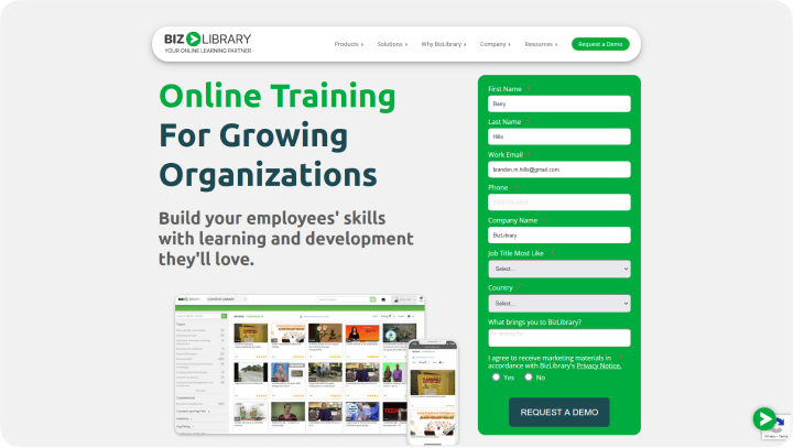
This was the first page to get the new brand treatment on the website - it was under performing. I was actually so sure that a redesign with an adherence to color contrast standards aside some social proof would have a higher conversion rate, I bet my job on it.
In hindsight, I should’ve bet a big salary increase. In the first quarter the updated design was live. Demo form submissions increased by 45%. Now, demo form submissions increase every single quarter.
Conclusion
By all accounts, the brand refresh was a successful one. I learned more about our target audience, how to effectively write and communicate brand decisions and guidelines, and how to create an impact on our company at-large with design.